I never had my own logo, that piece of graphics, or stylized text that people recognize you by.
Finally, after 20 years of work in several creative industry sectors, I decided to develop a graphic solution for myself. I hope you like this logo design.
How I started?
I only had these starting data:
– My initials D and P
– An idea to somehow include a play button because my main activity is a video creation
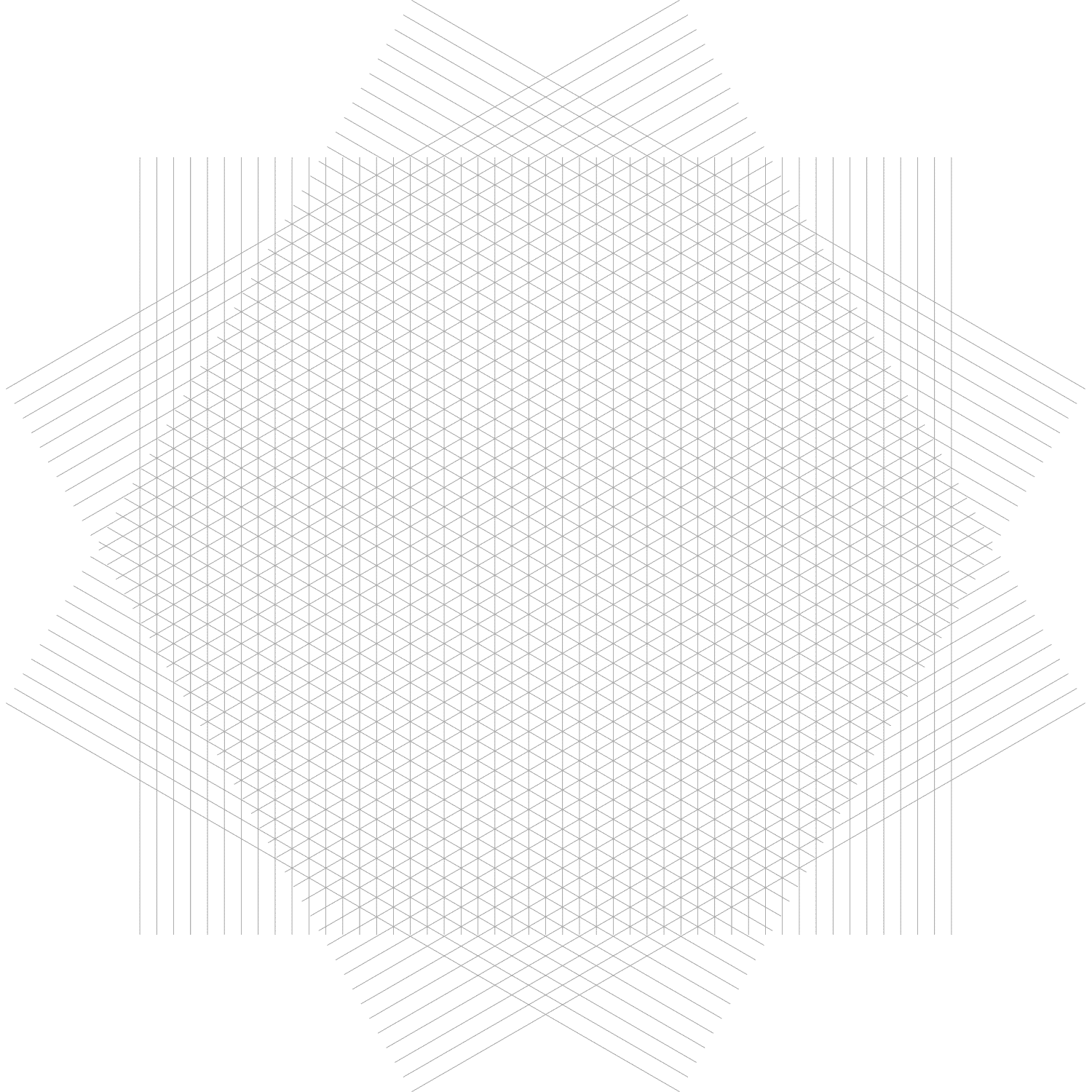
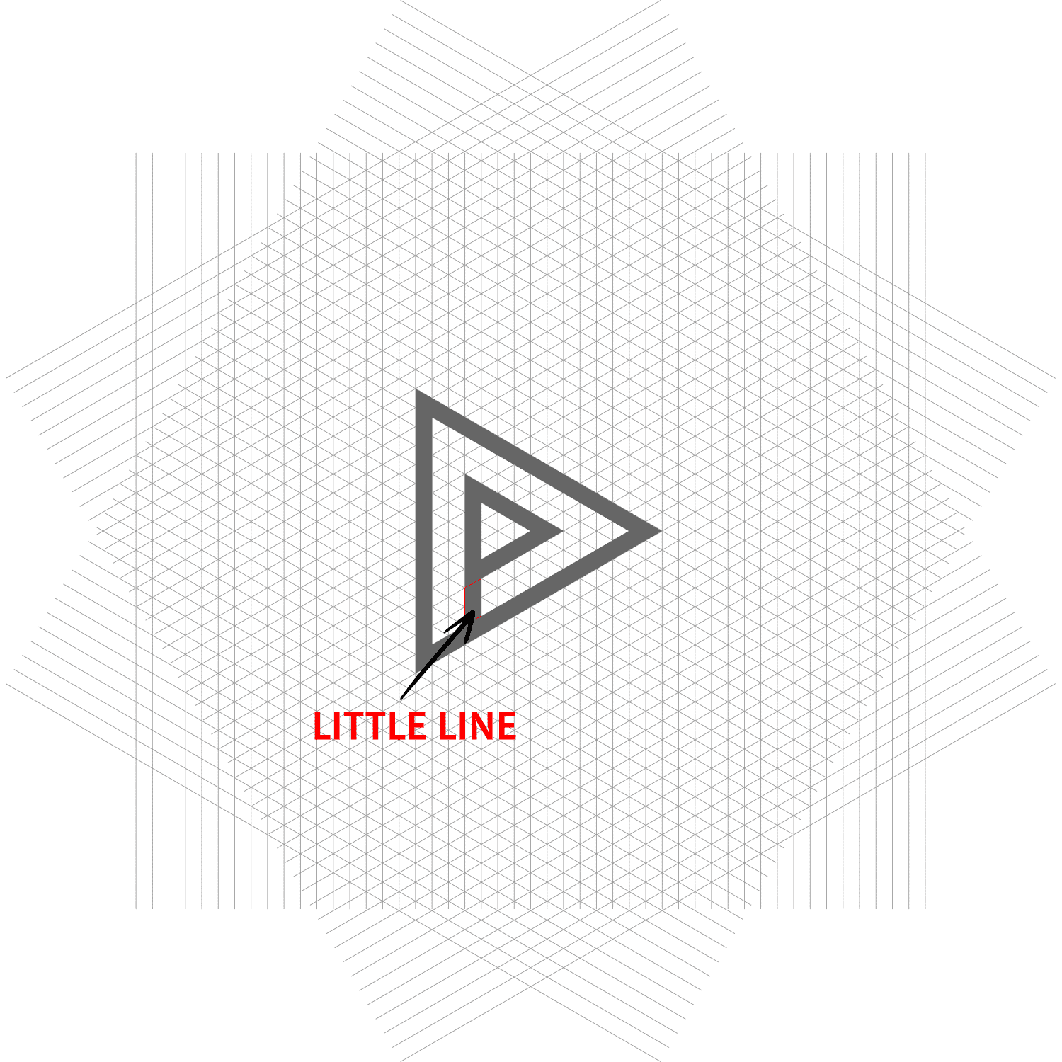
A grid
I started by creating this grid because the base is the triangle ► which can be the play button.
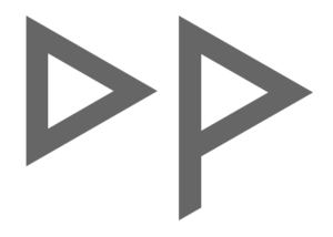
D and P
Fortunately, the letter “D” looks like a triangle if its right line is not a circular arc. The upper part of the letter “P”, also without a circular arc, looks like a triangle. Yay!
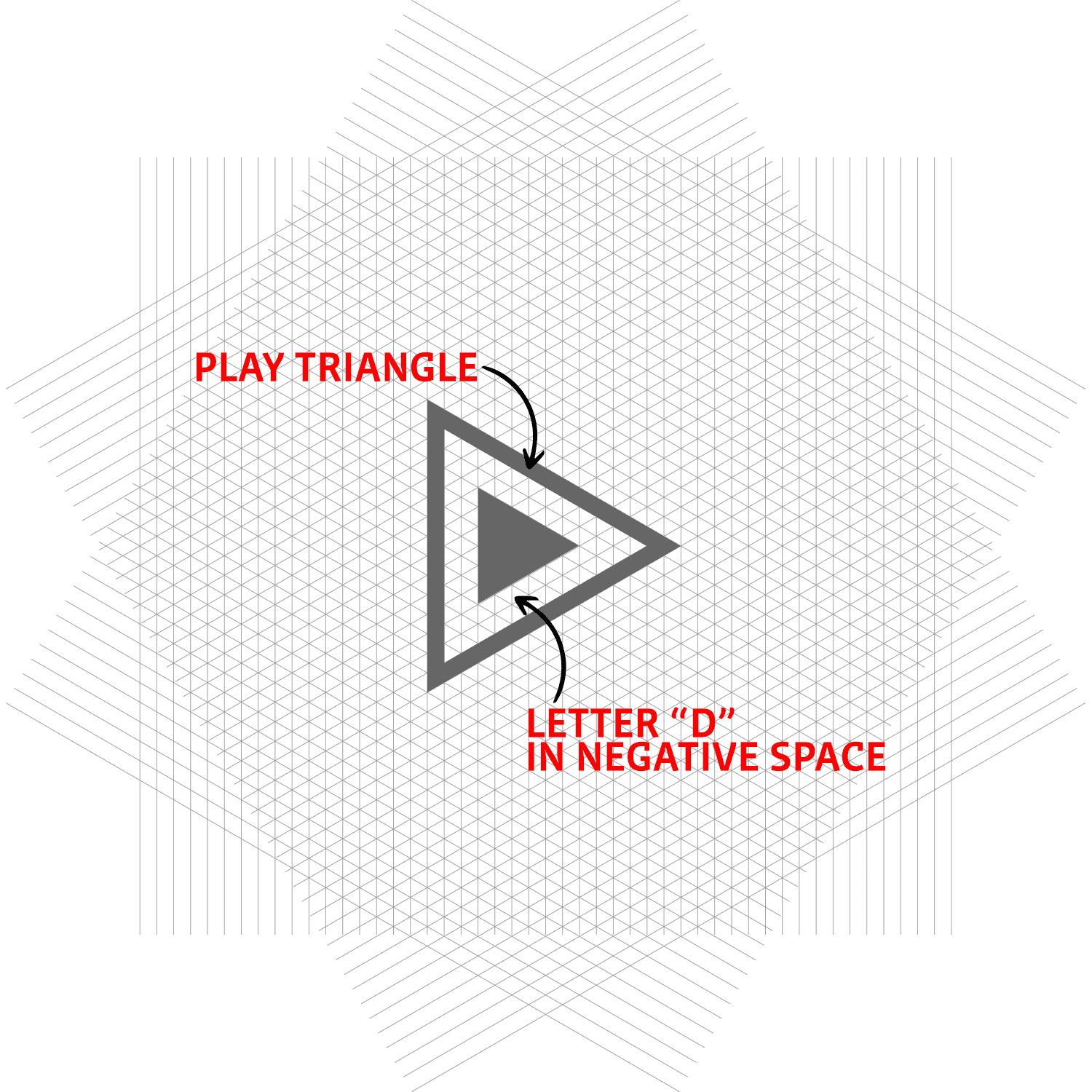
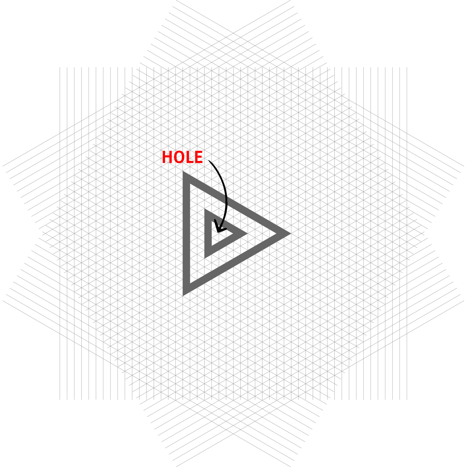
Next step: triangle hole
The final touch
And finally, a little line that forms the “P” letter.
Final version
The final version of the shape and the version with two color gradient.

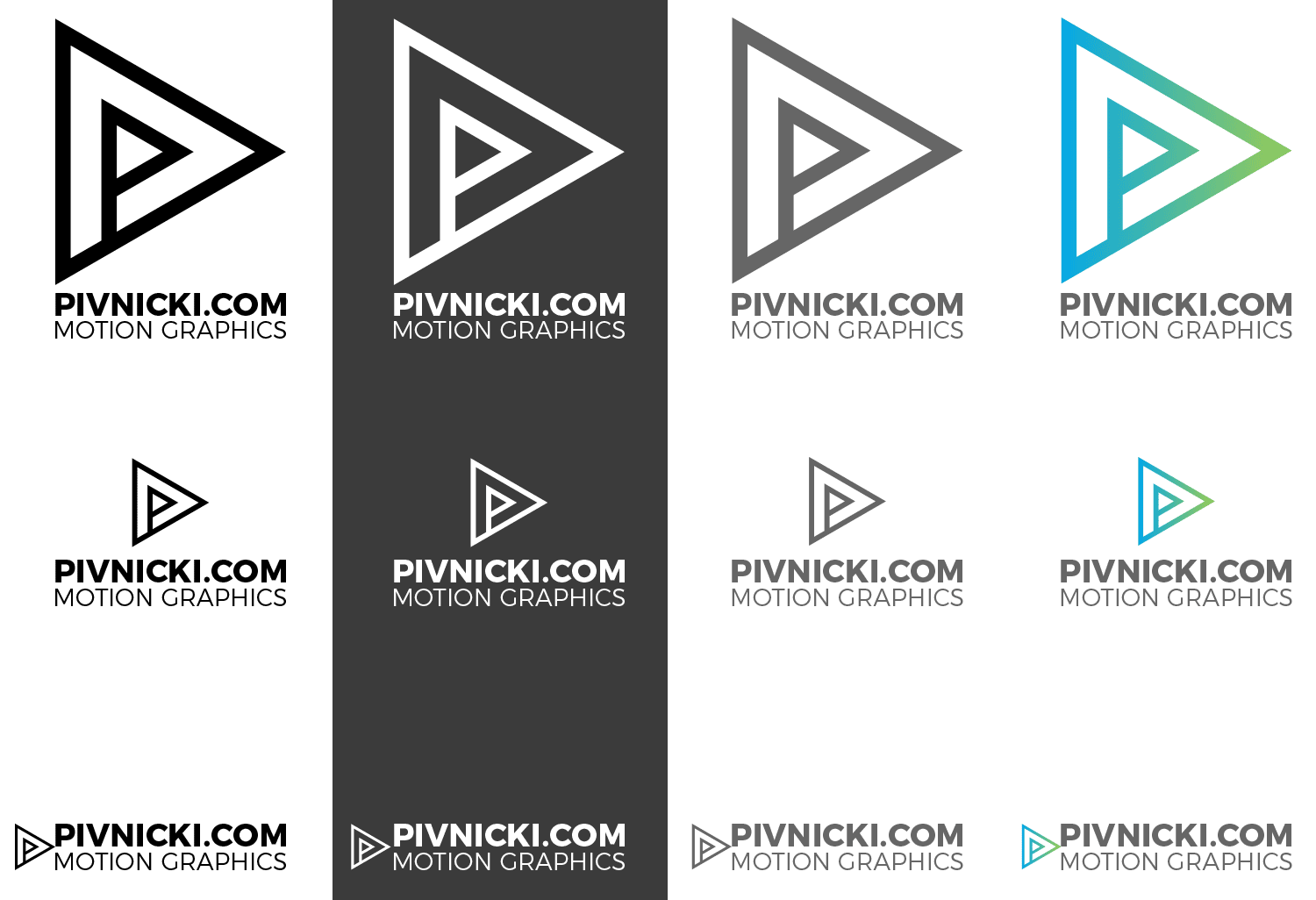
Color/text/size variations
Some mockups

If you want to try a grid-based logo design, let me know in the comment, or send me a message from the contact page, and I will send you an illustrator file with the grid to play with and if you need short instruction on how to do it.

Wow this is awesome !!
love it
Flot logo. Logo odlicno uradjen i predstavlja bas cime se bavis.